
How to Rank Your Business Series – Day 08
In today’s mobile-centric world, optimizing your website for mobile devices is no longer optional—it’s essential for providing a seamless user experience and improving your search engine rankings. Mobile optimization encompasses various aspects of web design and functionality to ensure that your site is easy to navigate, loads quickly, and looks great on smartphones and tablets. In this expert guide, we’ll explore the importance of mobile optimization, key mobile-friendly design principles, and practical strategies for ensuring that your site meets the needs of mobile users. Building on our previous discussions on On-Page SEO and local SEO, we’ll demonstrate how mobile optimization contributes to overall website performance and user satisfaction.
Let’s Understand Mobile optimization
Why Mobile Optimization Matters?
Mobile Usage Trends
Mobile usage trends refer to the increasing prevalence of mobile devices such as smartphones and tablets for accessing the internet and consuming online content. In the USA, mobile usage has been on the rise, with a significant portion of internet traffic coming from mobile devices. For example, according to Statista, mobile devices accounted for over 32% of all website traffic in the USA in recent years.
This trend highlights the importance of optimizing websites for mobile users to ensure a seamless browsing experience and cater to the growing mobile audience.

Google’s Mobile-First Indexing
Google’s mobile-first indexing is a shift in the way Google indexes and ranks websites, where the mobile version of a website is given priority over the desktop version for indexing and ranking purposes. This means that Google primarily uses the mobile version of a website’s content to determine its relevance and ranking in search results, making mobile optimization crucial for SEO.
Websites that are not optimized for mobile may experience lower rankings and visibility in Google search results, potentially leading to loss of traffic and engagement from mobile users.
User Experience Benefits
Mobile optimization offers several user experience benefits, including improved accessibility, faster loading times, and enhanced usability on smaller screens. By optimizing a website for mobile devices, users can easily navigate, read content, and interact with the site’s features without encountering issues such as small text, unresponsive design, or slow loading pages. This improves user satisfaction and engagement, leading to higher conversion rates and better overall performance.
For example, a mobile-optimized e-commerce website in the USA may see increased sales and customer retention as a result of providing a seamless mobile shopping experience.
Key Mobile-Friendly Design Principles
Responsive Design
Responsive design is a design approach that ensures a website adapts and displays optimally across various devices and screen sizes, including smartphones, tablets, and desktops. It uses flexible grids, layouts, and CSS media queries to automatically adjust the layout and content based on the device’s screen size.
For example, a responsive website in the USA will reformat its content and resize images to fit the smaller screens of mobile devices without sacrificing usability or readability.
Mobile-Friendly Navigation
Mobile-friendly navigation refers to the design of navigation menus and elements that are optimized for touch interactions and easy navigation on mobile devices. This includes using clear, concise menu labels, implementing hamburger menus for compact navigation on small screens, and placing important navigation links within easy reach of the user’s thumb.
For example, a mobile-friendly website in the USA will use a hamburger menu icon and prioritize essential navigation links for improved accessibility on mobile devices.
Touch-Friendly Elements
Touch-friendly elements are user interface elements such as buttons, links, and form inputs that are designed to be easily tappable and interacted with on touch screens. They are typically larger in size, with adequate spacing between elements to prevent accidental taps and ensure precise touch interactions.
For example, a mobile-friendly website in the USA will use larger buttons and clickable areas, allowing users to navigate and interact with the site’s content effortlessly on touchscreen devices.
Content Readability
Content readability refers to the legibility and readability of text and other content elements on a website, particularly on small screens. Mobile-friendly websites prioritize legible fonts, appropriate font sizes, and sufficient contrast between text and background colors to ensure content remains readable and accessible on mobile devices.
For example, a mobile-friendly website in the USA will use clear, easy-to-read fonts and maintain adequate spacing between lines and paragraphs for optimal readability on mobile screens.
Optimizing Page Speed for Mobile
Importance of Page Speed
Page speed is critical for mobile optimization as it directly impacts user experience, search engine rankings, and website performance. In the USA, where mobile users expect fast and responsive websites, optimizing page speed is essential to reduce bounce rates, improve engagement, and increase conversions. Faster-loading pages also tend to rank higher in search engine results, leading to better visibility and organic traffic.
Mobile Page Speed Tools
Various tools are available to measure and analyze the page speed of a website on mobile devices. Google’s PageSpeed Insights, GTmetrix, and Pingdom are popular tools that provide insights into performance metrics such as load time, render-blocking resources, and opportunities for optimization.

These tools help website owners identify areas for improvement and prioritize optimization efforts to enhance mobile user experience.
Optimization Techniques
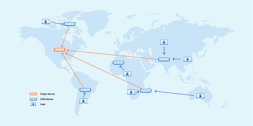
Optimization techniques for improving mobile page speed include minimizing server response times, leveraging browser caching, compressing images and files, reducing the number of HTTP requests, and using asynchronous loading for scripts and stylesheets. Implementing a content delivery network (CDN), optimizing code and scripts, and prioritizing above-the-fold content can also significantly improve mobile page speed.
For example, a website in the USA may optimize its mobile pages by compressing images, minifying CSS and JavaScript files, and using lazy loading to defer non-critical resources, resulting in faster load times and improved user experience on mobile devices.
Mobile-Friendly Content
Streamlined Content
Mobile-friendly content should be concise, focused, and easy to digest on smaller screens. Streamline text content by breaking it into smaller paragraphs, using bullet points and subheadings for easy scanning, and prioritizing important information above the fold. Aim to deliver key messages quickly and efficiently to mobile users in the USA, where attention spans are often shorter on mobile devices.
Visual Content Optimization
Optimize visual content such as images, videos, and infographics for mobile viewing to enhance user engagement and readability. Use responsive images that scale appropriately based on screen size, optimize file sizes to minimize load times, and consider the use of mobile-friendly formats like MP4 for videos. Ensure that visual content is clear, high-quality, and relevant to the content context, providing value to mobile users browsing the website in the USA.
Mobile SEO Considerations
Mobile SEO Best Practices
Mobile SEO best practices involve optimizing a website’s mobile version to improve its visibility and rankings in mobile search results. This includes implementing responsive design, optimizing page speed, using mobile-friendly navigation, and ensuring content readability. Additionally, optimizing metadata, including titles, descriptions, and headings, for mobile users can improve click-through rates and user engagement. For example, a local restaurant in the USA can optimize its mobile website for local SEO by including relevant keywords, location-based information, and schema markup to enhance its visibility in local search results.
Local Mobile Optimization
Local mobile optimization focuses on improving a website’s visibility in local search results and targeting mobile users in specific geographic locations. This includes optimizing Google My Business listings, ensuring consistent NAP (name, address, phone number) information across online directories, and encouraging customer reviews and ratings. Additionally, creating location-specific landing pages and incorporating location-based keywords can help attract local mobile users searching for relevant products or services.
For example, a local plumbing service in the USA can optimize its mobile website for local SEO by targeting keywords such as “plumber near me” and optimizing its Google My Business profile with accurate location information and business hours.
Conclusion
Mobile optimization is a critical aspect of modern web design and SEO, ensuring that your website delivers a seamless and engaging experience to mobile users. By implementing the mobile-friendly design principles and optimization strategies outlined in this expert guide, you can enhance your website’s performance, improve user satisfaction, and boost your search engine rankings in the competitive mobile landscape.
Stay tuned for more insights on ranking your business in the digital landscape.
AR
Owner of Web of Abhi – Online Business Solution CompanyWeb Developer | WordPress | SEO | Digital Marketing | Graphic Designer | Web Design